November 6, 2012

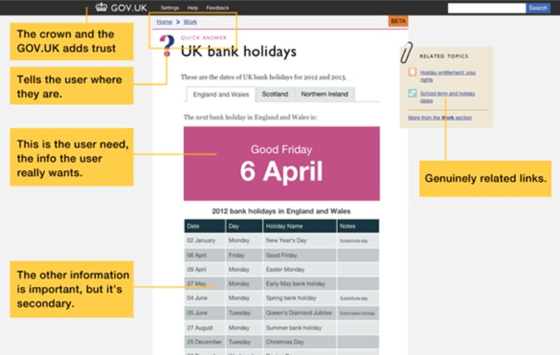
(Above: image from Gov.uk/designprinciples — Principle 10, Make things open: it makes things better.)
The UK government is leading the way in using design to create simpler digital services for its citizens.
A 2010 report commissioned by the government made a series of strong recommendations, including creating a single ‘front end’ for all government digital services, releasing API’s to government data, creating a central team with absolute control over all interaction experiences for digital services, and appointing a CEO of Digital with absolute authority over user experiences across all digital channels.
Under the direction of Minister for the Cabinet Office Francis Maude, the government followed these recommendations—and they followed them very well.
The result is the Government Digital Service under the directorship of Mike Bracken and the design leadership of Ben Terrett. They have attracted some great talent and are using the latest lean design and agile development practices. Their manifesto includes a set of design principles many organizations could do with living by, such as:
The first major release from the Government Digital Service is Gov.uk, a one-stop shop for government services such as renewing licenses, finding out about pensions, registering deaths, and a host of other things. Terrett claims that Gov.uk replaces 750 government webstes that previously delivered the same services and information.
From a design point of view, what is remarkable to me is the absolute simplicity with which information is presented. No gratuitous imagery or complex navigation. The site uses simple text and simple layout, cleverly putting the information you are most likely to want right in the center of the screen in very large type. Some designers might view the visual design as looking more like a wireframe, but I find the clarity very refreshing. Gov.uk is a wonderful example of the power of design to make the complex simple. I look forward to seeing what the UK Government Digital Service creates next.
In the wake of Hurricane Sandy, it has never been more apparent how much we rely on well-delivered digital services and information from our governments. How might we encourage a similar movement in the US?
(posted also on my LinkedIn Thought Leader blog)